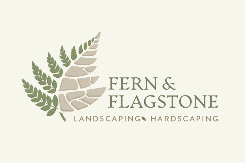
We rebranded Fern & Flagstone from a basic mark into a confident, professional identity that reflects the craftsmanship and permanence behind their landscaping and hardscaping...
We rebranded Fern & Flagstone from a basic mark into a confident, professional identity that reflects the craftsmanship and permanence behind their landscaping and hardscaping...
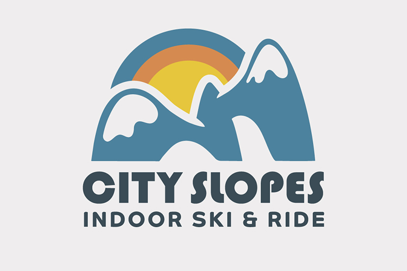
Kicking off the year with a brand project for City Slopes Indoor Ski and Ride! We went with a retro 80's feel and creating...
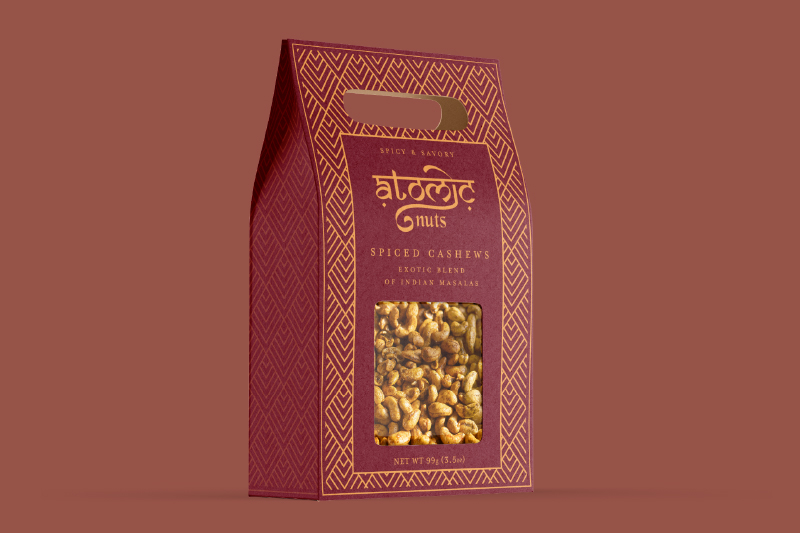
We built Atomic Nuts from the ground up. From shelf to screen, we positioned the brand to feel like it should: some of the best...
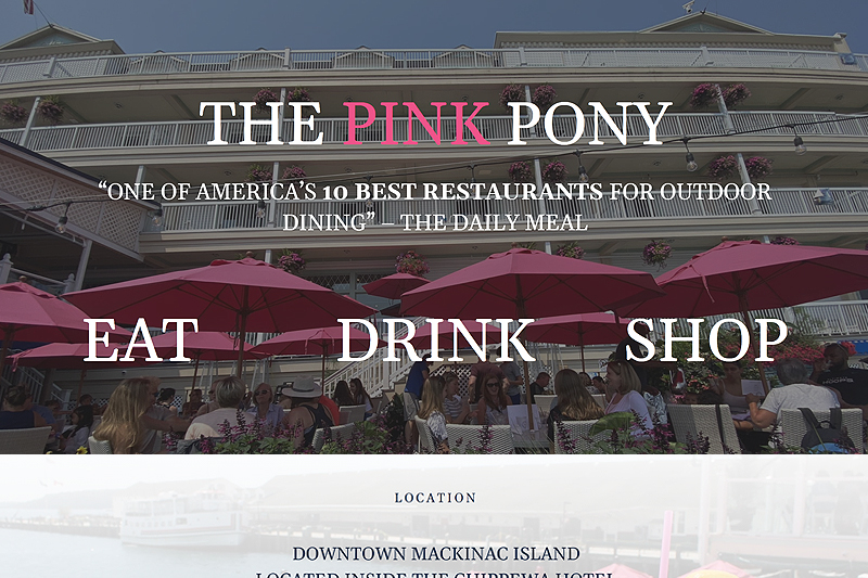
In the heart of Mackinac Island's vibrant scene sits a cherished gem – The Pink Pony. A beloved bar and grill with an iconic outdoor patio, The Pink Pony has become...
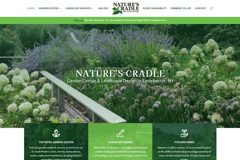
Nature's Cradle Nursery came to us in need of an updated look and SEO strategy for their website. Based in Eastchester, NY, they offer a variety of native plants and shrubs as well as environmentally friendly and organic landscape design services. Their site needed to reflect these modern services as their old site was generic and outdated.
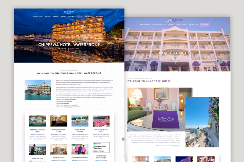
One of our largest projects to date, Dog Ear took on the Lilac Suites and Chippewa Hotel Waterfront's websites...
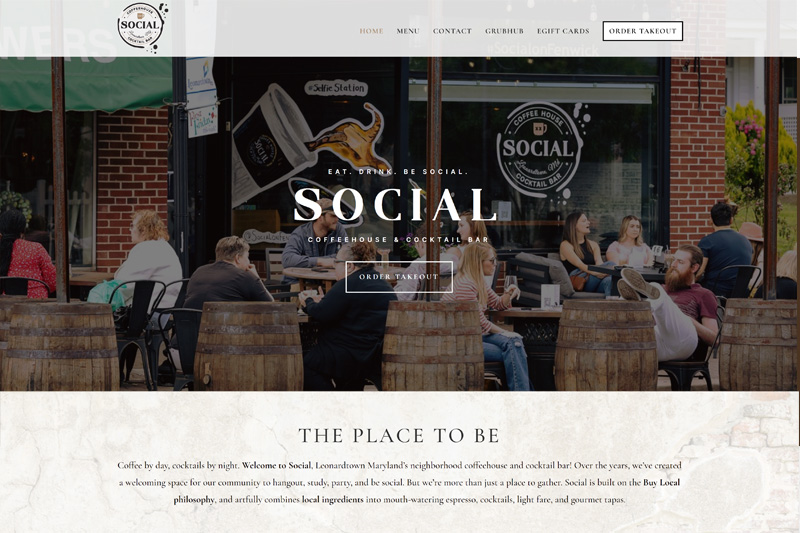
One of our longest standing clients, Social, wanted an updated brand and design for their website. Our previous design was reaching 5 years in age, and Social has since transitioned from "small town coffeeshop" into the cool place to be for brunch, cocktails & lattes in Leonardtown, MD.
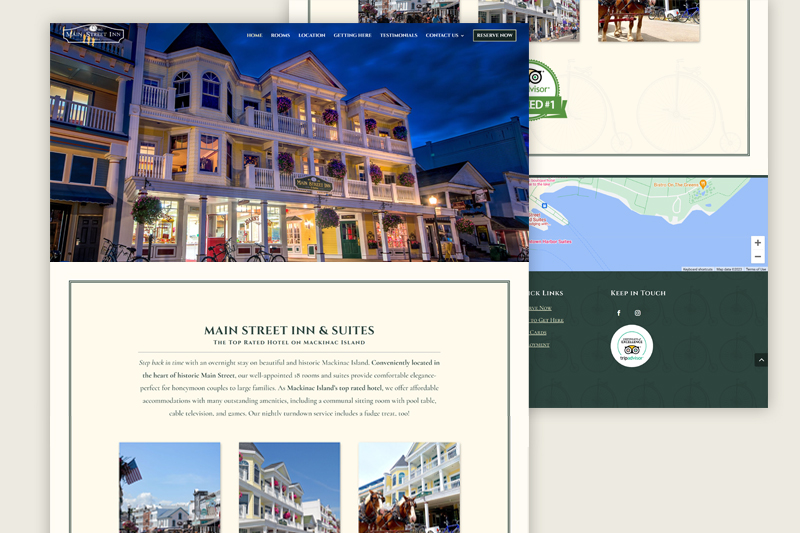
Despite Mainstreet Inn & Suites being the top ranked hotel stay on Mackinac Island, their website was a 1990's relic. We polished it up, made it responsive and modern, and incorporated the design elements and SEO strategy it deserved.
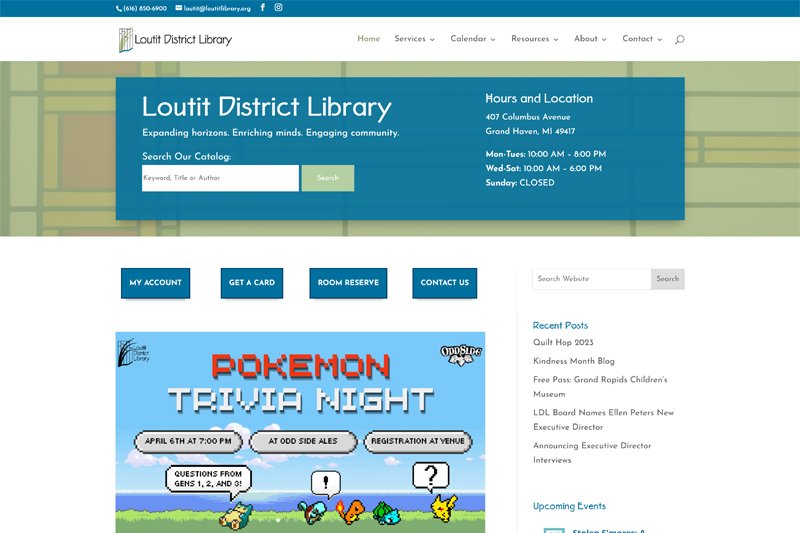
Loutit was a unique project in that the site needed to service the community of Grand Haven. Along with a website redesign to keep patron use and catalog search in mind, we also built out genealogy databases including births, marriages, oral histories and atlas images.
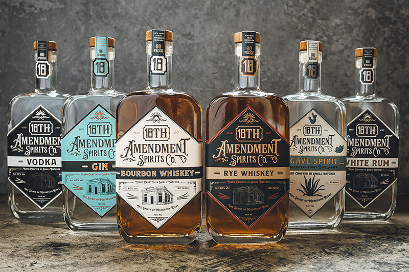
The owners of 18th Amendment Sprits Co. needed a fresh logo design that matched the mood and history of their unique space. The distillery and bar are located in the old Savings Bank building in downtown Muskegon.
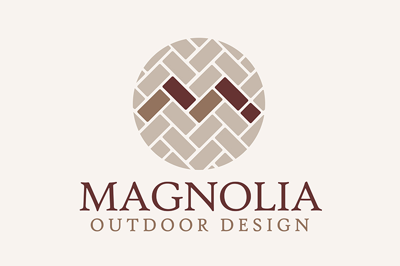
Grand Rapids hardscape and landscape company, Magnolia Outdoor Design, needed a fresh new look for their brand new business. Spring was right around the corner so business cards, shirts and caps were a must. Dog Ear created a logo that represents the services Magnolia provides to our neighborhoods this spring and many springs to come.
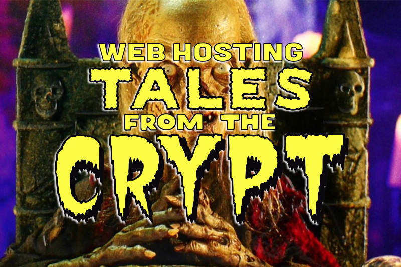
Greetings. These tales explore the ugly underbelly of being overcharged and underserved in web hosting. They often begin with a well-intentioned business owner in need of a website. The hosting providers they encounter, however, often lead to… dead ends. Or worse! Money down the drain. Be sure to steer clear of these all-too-common tales and work with a hosting provider who's got your back.
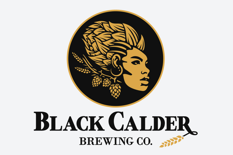
Black Calder Brewing Co. plans to be the first black-owned brewery in Michigan. As such, they wanted to pay homage to African culture and needed a logo that represented their drive, diversity, and of course, craft beer!
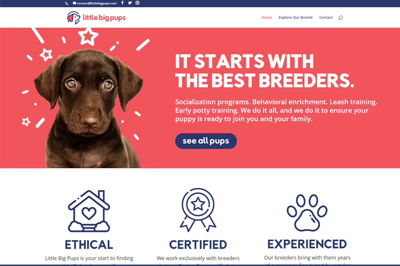
Little Big Pups had a business plan in mind, but was starting from scratch on a website. We provided hosting, maintenance, ecommerce capability, web design and development to get them started. Each breeder working with Little Big Pups must achieve Canine Care certification from Purdue University to have their puppies listed.
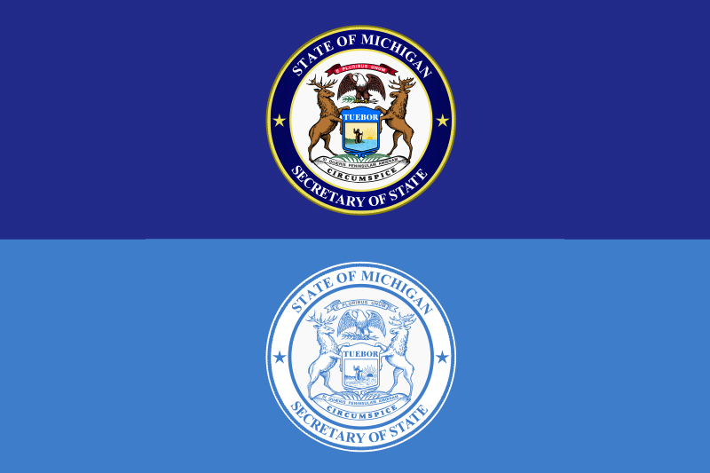
The Michigan Department of State (MDOS) / Secretary of State reached out seeking a proposal for a brand style guide that would include such things as color palettes, typeface families, proper display and use of logos, etc. Over the years there were many MDOS logo versions and colors floating around and the Director of Communications wanted to get a handle on using the brand consistently for Michigan residents.
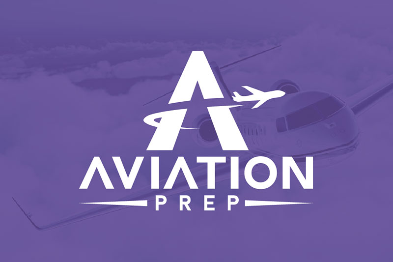
See the brand design for a corporate pilot with a strong teaching background. He started AviationPrep.com in 2020 to create online courses to teach pilots at charter aircraft companies. All of our brand packages include three logo designs to choose from that perfectly represent the business.
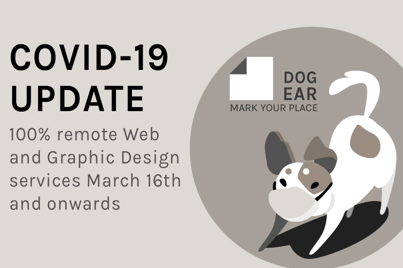
Dog Ear has always been 95% remote, and moving forward into April (and possibly beyond) we will be a 100% remote web and graphic design agency. Our discovery questionnaires and walkthroughs make it seamless to learn what you’re after and how exactly we can help. We do all estimates and invoicing online with PayPal, Apple Pay or checks in the mail. We’re available during business hours (and usually late into the night) for text, call and virtual meetings.
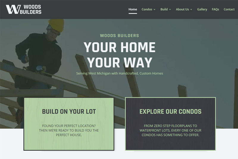
Our latest (and largest) web project to date is now live! Woods Builders needed a site re-design and restructure with a buyer journey in mind. The previous design had little strategy and didn’t showcase the most popular development options Woods sold. With dedicated landing pages and Hubspot forms, Woods is able to collect leads and know what the contacts are looking for before reaching out.
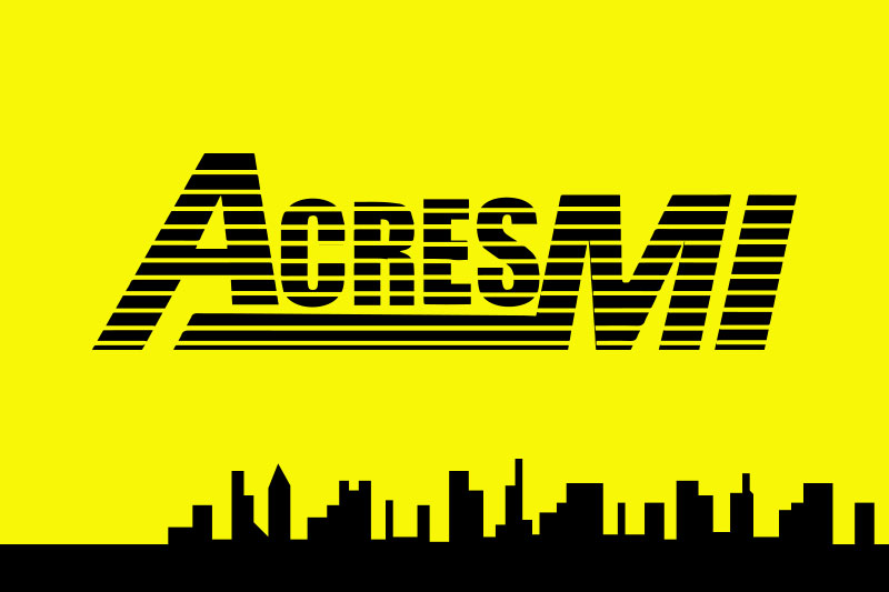
AcresMI is a Midwest commercial real estate company based in Grand Rapids, MI. Their mobile office gives them the flexibility to meet clients anywhere on-site, something they wanted to boast about on their website. AcresMI's old site looked to be fresh off the boat in the year 1892. We used WordPress to create a responsive design that brought them up to speed, showed off their featured properties and added some much needed clout to the brand.
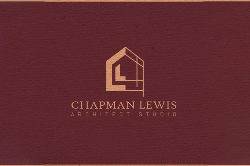
Studio Chapman Lewis contracted us to design a logo and brand that represents their budding architecture business. With humble beginnings, the experience and talent the owner provides will lead the studio to future success.
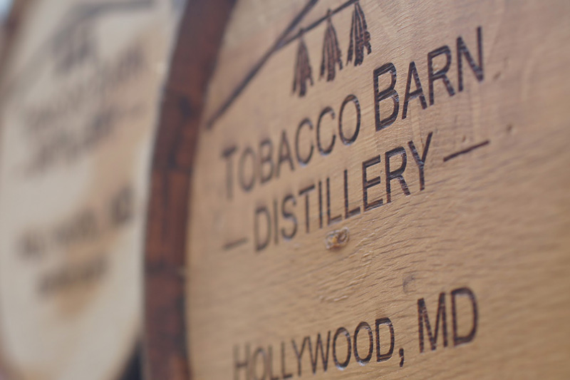
Tobacco Barn Distillery boasts as the birthplace of bourbon and needed a website to match this bold claim. Through sitewide branding, design and color, their history shows through and customers are now able to easily find their products.
Every business owner has had to make a change to her or his business plan in order to stay ahead. Depending on the change, the logo may need to be updated. It could be a small tweak or a complete re-design. Dog Ear Marketing recently helped two clients undergo changes. We were able to make it effortless on the part of our clients, and more importantly, inexpensive.
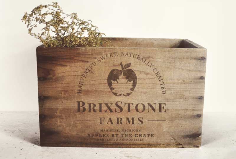
BrixStone Farms is an apple orchard purchased in 2019 that's owned by an environmentally conscious farmer utilizing the latest in research to reduce his footprint and focusing on being a good steward of the land. The farm needed a fresh yet rustic logo that spoke to what they do and attracted young millennials and established families alike.
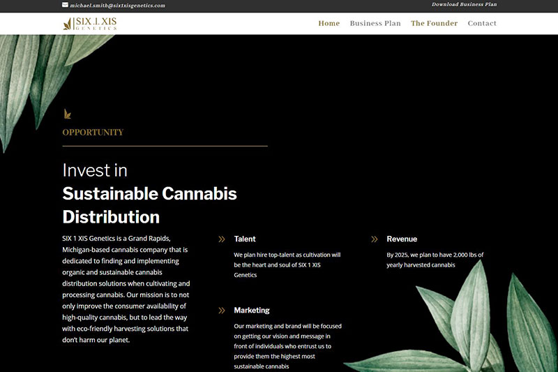
Six.1.Six Genetics wants to be the future leader in sustainable cannabis distribution. As the cannabis market expands in Michigan, smaller competing companies need to stand out from the pack. We designed and developed a site that fit the needs of Six.1.Xis, was 100% responsive, and was optimized with only a 1.9s load time.
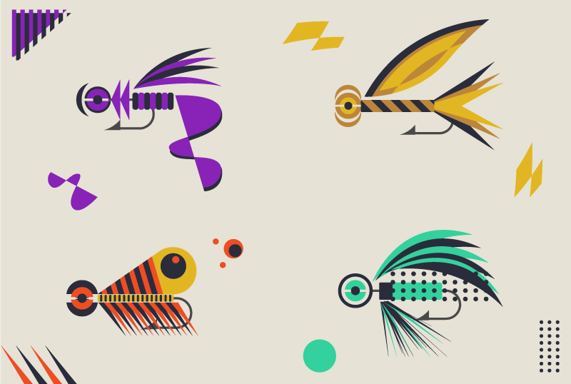
Recently took up the task of taking on a side project for fun! These abstract fishing lure designs were inspired by a similar logo project for a local fly fishing club.
Partnerships bring new skillsets to the table, and Dog Ear has formed a partnership that will benefit all web clientele moving forward.
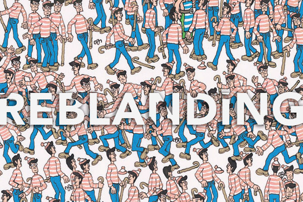
How companies across the globe are ditching their standout brands for ones that blend in and how designers are coping.
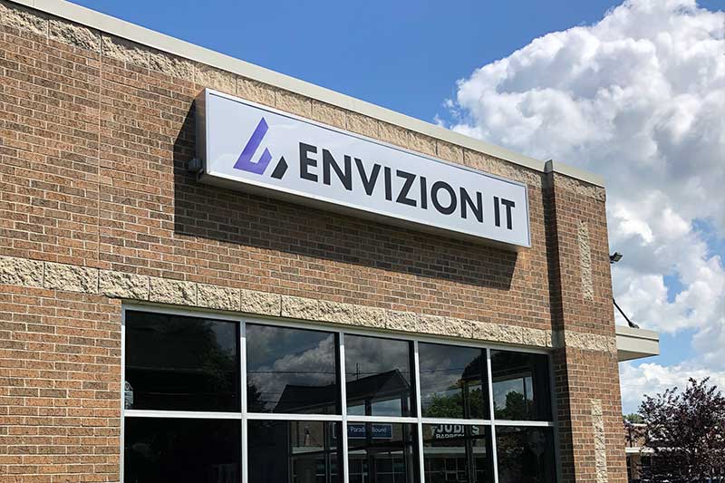
Envizion IT is a new Zeeland, MI business that was looking for a great brand to pave the way. In order to stand out and look like the professional IT specialists they are, they sought out a modern, trustworthy brand with an easily managed one-page site.
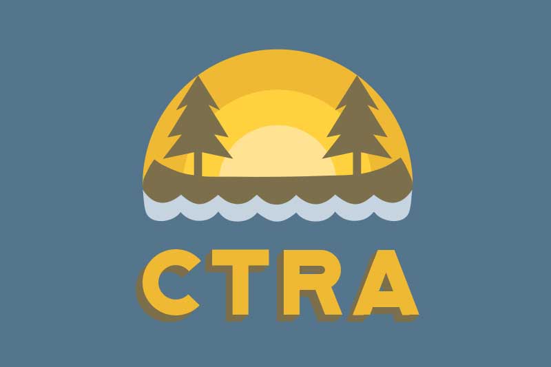
CTRA needed a better, modernized way to keep their members informed and up to date on their dues. This project included a logo design, HTML website and social media page creation. CTRA now has a mobile-friendly site that points members to events and donation drives. They also have over 100 followers on Facebook that have been added to the loop.
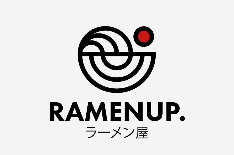
Ramenup hopes to become the hottest ramen joint in the city of Minneapolis, Minnesota. Started in 1993, Ramenup wanted a completely new look and feel that represented their craft. Over the centuries, their ramen recipes have been perfected in both taste and appearance. It was time their brand underwent the same transformation.
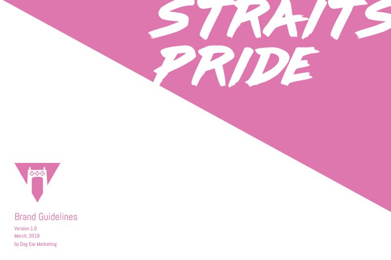
Straits Pride is an LGBTQ+ advocacy group that encourages understanding and promotes visibility of the queer community in the Mackinac Straits, Michigan area. After successfully filing for a 501(c)(3) status, they were officially registered as a LGBTQ+ advocacy organization and needed help with the use of their logo and brand.
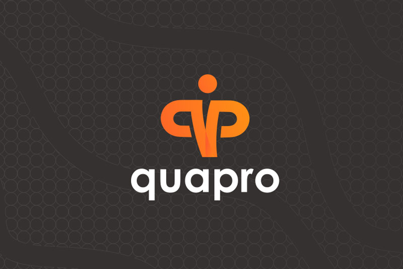
Quapro is an online fitness products company headquartered in Frankfurt, Germany. This presentation outlines the process of updating their logo, a stock image the company had bought online. The new logo seeks to impress with a feeling of assurance and strength. The design combines the initials q and p with an athlete flexing and presenting a confident posture to the world. The chosen colors also pay homage to the company’s German origins.
While all of our projects share a common roadmap highlighting the main stops, each client comes with a completely custom itinerary based on their own desires and goals. We personalize each project for the perfect fit in budget, project length and desired results.

Alternate Vape strives to be a leading, more natural CBD e-liquid solution than their competitors. The new brand needed to reflect AV's purpose of selling all natural CBD hemp oil to empower a healthier lifestyle while standing out on a crowded shelf and resonating with their millennial target audience.
The internet opens your business up to a huge audience, but it also opens it up to a world wide web of competition. The upside is that if you stand out enough to be found and speak in a way that engages your target audience, the internet can also make your business hard to ignore.
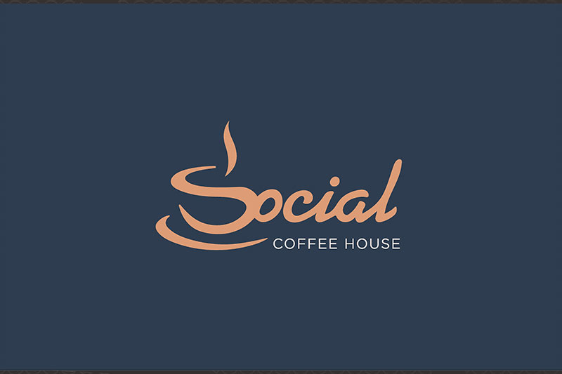
Social Coffee House wants to capture a sophisticated, yet welcoming brand for its patrons. Based on the location of the cafe and the existing marketing strategy, the target audience is college age adults that come in to grab a cup or stick around to socialize with friends. Social Coffee wants to get the message out that they brew coffee the right way and create a classic coffee house atmosphere where you can sit back, relax and be social.
A brand is the collective perception of everyone who knows you exist, and nothing has a greater impact on your success. The way your brand is recognized goes beyond your logo, slogan and colors. It’s a direct interaction and conversation with your audience and, like any part of business, there’s a right and wrong way to go about it.

Grand Rapids Hide Co is right in the mix of history and a bustling, growing West Michigan city. Built in 1862 on the shores of the Grand River in Downtown Grand Rapids, the goal was to incorporate its rich heritage while appealing to the growing younger generation in the area.
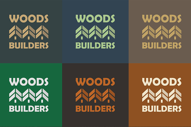
Woods Builders has been building single family homes since 1996. They were looking for a new logo and color scheme that was modern and easy to implement. It needed to convey trust, sturdiness, and workmanship while incorporating the Woods surname.
Ad campaigns are a set of advertisements that focus on a single message or a particular goal. A campaign can set out to raise brand awareness, drive sales, generate leads, or drive traffic to a single web page. No matter the objective, a campaign usually provides a limited amount of space for text and media, requiring an effective strategy to engage and call consumers to action.

Dog Ear Marketing was created by Katelyn Berkshire, a digital designer, dog owner and proud Michigander. Since its inception, Dog Ear has helped to brighten businesses through design and marketing around the world.